Showing posts with label internal. Show all posts

Thursday, August 15, 2013

What's Up: August

Summer is coming to an end, but that means one great thing – fall is on it's way. We love the nice cool breezes, falling leaves and, most of all, the baked goods that it seems to bring with it! To all of those who came and saw us at the Fremont Art and Wine Festival – thank you, thank you, thank you! You can check out photos and see what a great time we had on our Facebook page.  Now, onto our What's Up....August edition:


Del Monte Refresh
Jason shared Del Monte’s new label for their canned produced.  We all agreed that the farmer’s market look gave the consumer a fresh and more appealing impression of the produce.


Absolute SF
Absolut Vodka chose our city by the bay for their limited edition series.  The bright colors caught Barbara’s eye, and the flavors sealed the deal.  The clever messaging did a great job of capturing the personality of our unique city.  Now, where’s that club soda from last month?


Tea of a Kind
Tea of a Kind got Cyndi’s attention because their bottles were just pretty and sparkly.  An added bonus was the unique way the tea is stored in the cap.  Twist the cap and the flavored tea infuses with the water to create a fresh brew.


Lindt
Hello My Name Is…CHOCOLATE!  Ying shared this new line of chocolate bars by Lindt.  We loved the fun, clever messaging and quality printing.  It was not easy to let these out of the meeting without trying them!


Kellogg’s
For the first time in Kellogg’s history, they are offering retro-inspired packaging. The launch is part of a program celebrating Froot Loops 50th anniversary. Ying discovered these fun throwback designs and we think they’re G-R-R-REAT!


Cottonelle brand refresh
Whoa, that’s a lot of TP!  But John lugged these quantity packs in to show us this redesign from the purple package to the white package.  We all agreed that the new design was very generic and could be mistaken for a store brand.  Exactly what you don’t want in a package for a national brand. 


PopChips
PopChips new very very bright packaging made it impossible for Barbara to walk by without taking a closer look.  That’s when she found that one of them was also co-branded or sponsored with a celebrity endorsement.  Very unusual, but we think they did a great job of maximizing the partnership.   

Monday, July 8, 2013

What's Up: July


It's that time of the month again...and we're here to show you "What's Up!" We've rounded up some products that our team has found in the marketplace and are stoked to share them with you. Keep us in mind when you're out doing your shopping as well; if you see something cool – snap a photo of it and share it with us on our Facebook page!


Coffee concentrate
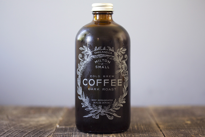
Chava shared a great find in this coffee concentrate by local company, Milton and Small. We loved that the bottle shape and print style gave it a vintage look. The clever messaging was an added bonus to the success of this package.


Spitz
Spitz brand of sunflower seeds is the first of its kind to feature a re-sealable package, which attracted Ed as a huge selling point. How did this take so long?


Coke-sharing can
Coca-Cola always has amazing marketing strategies, and they have once again impressed our tea. Jason came across these cans with a twist, designed especially for sharing with a friend.


Wine boxes
Trader Joes’ Block Wine has a great package design that stood out among the other boxed wines on the shelf. Well designed in just one color, and their clever use of content, helped them fall right into Cyndi’s shopping cart.


Glade spray
Ying found this line of Glade air freshener with a unique flower petal design spray bottle.  Who wouldn’t want a product that looks AND smells pretty?


Hansen's club soda in small cans
Most of us have thrown out the half full bottle of soda water after it has gone flat.  These small serving cans offer a great solution to that problem, and we also thought they looked super cute!  Success in design and function?  You know we love that!

Friday, May 10, 2013

What's Up: May

Why hello May, you sure did creep up on us. Summer is fast approaching, and we're all looking forward to the warmer temps and vacations! Check out what our team found for this month's what's up meeting:


Cyndi noticed that Tazo Tea has had a total brand make over. The team felt that the change might be too drastic, since it will be competing on a shelf full of lesser known brands. Tazo is one of the few brands with significant equity in the tea industry, and we felt they should have better protected it What do you think? Would you recognize the new packaging?


Gillette continuously develops cool new looks for their ever-changing line of products. John felt this was a good example of packing that is successful without being expensive. Nicely done!


Jason came across this package design for Goal Zero’s portable speakers. We felt that the structure design and printing were well done for an off-brand product. Again proving that successful packaging just has to be smart, not expensive. Good find!


Check out this package for Aura Tea that John found! We LOVED how their logo was mimicked in the structural design for the TranquiliT package. The result is a beautiful, clean design that is sure to stand out in a very competitive market.


Retro always seems to be in style! Check out the Mike & Ike throwbacks Barb discovered in the candy aisle. The vintage look held its own on a shelf packed current designs for sweet treats…but only while supplies lasted. Not sure it will last long here in the studio either!


Lasting brand equity lives in products like Liquore Strega. Chava remembers this bottle always being a part of family celebrations, and the brand is connected to great memories throughout his lifetime. We are sure Chava is not alone in his fondness for this brand. The logo, bottle and art have had minimal changes since the origin of the product in 1860.


Tuesday, April 2, 2013

What's Up: April Fools Edition

When it comes to packaging, we know that bad things can happen when you don't use BIG. You could end up with eighteen different fonts, incredibly wasteful packaging, or marketing with more messages than the evening news. In the spirit of this April Fool's Day, we thought this month it would be fun to share What's WRONG.


John found this eco-friendly banana packaging. And not to mention, the use of cellophane wrap gives the customer a full view of the product. An example of good packaging? Now that's bananas!


Chava knows his hair care products (although we are pretty sure this one has never touched a hair on his head.) But we all agree that the illustration of a gorilla with post nasal drip totally sells style!


Ed loves type, but even he would say this is too much of a good thing! John found this plant fertilizer with too much to say and too many ways to say it. How many typefaces do you count?


Barbara snagged these mesh hair nets for obvious reasons. We're not sure what we love most - the modern photography or the quantity callout. It all meshes so well doesn't it?


Friday, January 11, 2013

January 2013 What's Up

Happy New Year! We are pumped for 2013 and can't wait to see what exciting things it brings. We all had a great BIG holiday break and enjoyed times with friends and family. We hope that you did too! Let's get this year kicked off with our first What's Up of 2013:


Java Tea Co
Barbara is a BIG tea lover, and she found a small west coast tea company called Java Tea Co.  By supporting their small company through the Kickstarter Program, she received three different teas packaged in hand-labeled tins.  We loved the logo, packaging, and amazing smell delivered with these teas.


 AU
Chava recently went to Mexico and shared some great items with us.  Among them was this beautiful package design for AU Olive Oil.  AU is the symbol for the element gold in the periodic table, and the package itself resembles a brick of gold.  This is to convey the value and pureness of the product.  “AUsome” share, Chava!


Old Spice
We are all familiar with the iconic Old Spice buoy bottle.  Yes, it might seem dated, but vintage brands have been on the comeback trail for a while now.  Old Spice has some great marketing strategies that are getting noticed by the younger target markets.  From ridiculous commercials to tag lines such as “If your Grandfather hadn’t worn it you wouldn’t exist,” we are all enjoying their latest campaigns.


Argo Tea
Did we mention that Barbara LOVES tea?  And she’s making us all fans!  This Argo Tea was very colorful and eye catching on the retail shelf.  We liked that it was packaged in glass bottles, which gave the impression of a higher end product than those in plastic bottles.   We liked the icons and images used in the design, and the flavors are unique and piqued our interest to try them all.  Well done, Argo! 


Moonstruck
John shared the packaging design of an Oregon based chocolatier, Moonstruck Chocolate Co.   We were impressed by how much fun and whimsy they achieved in their mostly one color designs.  And we loved how the illustration continues around all four sides of the package.  It takes a really special design to make us hesitate before we devour the chocolate inside, and this one did.

Wednesday, December 12, 2012

December What's Up

It's our last What's Up of 2012! In just a few short weeks, we'll be closing up the office to celebrate the holidays with our friends and family. But don't worry – we'll be back and ready to get hard to work in 2013. Just in time for our next What's Up meeting. Happy holidays from the entire team at BIG. But first...What's Up December!


Nest Learning Thermostat
Chava had recently purchased the innovative Nest Learning Thermostat for his home.  Our team was impressed by both the package and the product inside.  And Chava was excited because he was not only able to easily install the thermostat himself, but the mobile app allows him to make adjustments when he is away from home.  Nest has really thought of everything, and we appreciate that in a company.  To learn more about this product, check out www.nest. com.


Absolute Tune
Chava found this AWESOME package for Absolute Tune, which is marketed as a “Sparkling Fusion” between vodka and white wine.  It is showcased with a unique double design label.  The beautiful outer wrap unzips to reveal a second gorgeous design underneath.  This bottle is faaaanccyy!  And a perfect way to celebrate NYE or any special occasion.


Starbucks gift packages
Ying spotted these holiday gift boxes at Starbucks. The advent calendar packaging was very creative, as was their entire holiday display.  It creates an urge to impulse buy; even if you don’t drink coffee!  Our team discussed how consistently strong Starbucks is with their retail packaging and gift items throughout the year.   Well done (extra hot, with whip)!


Caterpillar shoe package
As you can see, this is no ordinary shoebox!  John shared this packaging design from Caterpillar that gets its inspiration from a bulldozer’s track.  We liked the detail of the corrugate band and the minimal use of materials.  This look is sure to set this item apart from the other work boots on the shelf!


Speck
Check out this peggable Speck package that Ed found at an Apple Store.   A button on the back of the clamshell allows you to slide the product out without damaging the outer package design.  We also liked the look of the printing (done at a local print house);  the varnish really adds a layer to the package design to help it to stand out.

Monday, November 12, 2012

November What's Up

Are you getting as excited for Thanksgiving as we are? BIG staffers sure do love to eat, so this is one of our favorite holidays. Because really, what's better than a day with friends and family and a spread of delicious food?


Arizona Beverages
Ed shared this contest-winning design for Arizona Beverages’ 20th anniversary.  Artists from around the world submitted illustrations for their Cherry Lime Rickey flavor. We agree that the final design is a BIG winner!


Stiga
Check out these COOL ping pong paddles Ying shared.  The paddles were offered in vibrant colors, and then they took full advantage of the look with the coordinating clear package.  This is a great example of packaging giving a product the competitive edge.


Campbell's
Campbell’s released a limited edition label design series celebrating 50 years of Andy Warhol’s iconic work.  We LOVED LOVED LOVED these soup cans.  How could you not???


Simply Bliss
John thought this Simply Bliss ice cream package design was simply beautiful.  The layout and use of quality imagery will help this brand get noticed in a very competitive market.  And it made us all want ice cream, so job well done!


Biotherm Homme
When Chava brought in this package from Biotherm Homme, we were impressed with the metallic printing and use of product image.  But wait, there’s more!  Instead wasting paper on an insert, the product instructions have been printed on the inside of the package.  There is perforation to make it easy to open and read. Somebody is thinking INSIDE the box for a green solution, and we think that rocks!


Pop Tarts/Clif Bar
Barbara found these limited edition products with a seasonal look. These brands are already dressed in their holiday best. 


Orbit
These mini-packs of gum are perfect for those times you don’t want to carry a purse but want to keep away the yuck mouth.  No more finding gum stuck in the pocket of your jeans after washing.

Friday, October 12, 2012

October What's Up


Why hello October, you are here already? The holiday season has officially begun! We're all getting very excited for Halloween and can't wait to share our costumes with you. Like last year, we'll be heading out to a team lunch to show them off. But don't worry, we'll show them off on Facebook as well. Make sure you like our page so that you don't miss out!


2012 Nike Women’s Campaign
John shared the 2012 Nike Women’s Campaign, which features first-person outlooks on how sports and fitness has shaped women’s bodies and attitudes. We loved the visual impact of the ads, which communicated both strength and beauty.  They matched the visuals with content that also packs a punch.  Well done!


Tout Sweet
Chava recently visited Tout Sweet, a patisserie in San Francisco.  The shop’s clean, vibrant design is upstaged only by the amazing treats behind the glass.  Tout Sweet has creatively designed to-go boxes and bags featuring the compound formula for sugar, which is super nerdy cool. Since SOMEONE (named Chava, but we won’t point fingers) didn’t bring us any samples, we think a field trip is in order!  


Boom Chicka Pop
Get your sunglasses! These bags of BOOM CHICKA POP are screaming to be grabbed off the shelves.  Barbara saw them from several aisles away!  Once you’ve adjusted your eyes to the bold and bright packaging design, you can check out the clever messaging on the bag.  We were glad we gave them a closer look.


Wednesday, September 5, 2012

September What's Up

Fall is almost here! You know what that means...lots of candy consumption in the BIG office. Which also means, we will probably see some candy packaging at next month's What's Up meeting. Stay tuned for that, but in the meantime, check out these great finds from the BIG staff!


Ugmonk
We shared in the full consumer experience when Chava opened the newest promo from Ugmonk. Enclosed in a birch wood package were a 4th anniversary T-shirt, a collector’s card and limited edition letterpress block. Wow, what a cool promo!


Giada/Target
Target is carrying a line of specialty foods by the Food Network’s Giada De Laurentiis. Jason shared that her brand and display had a strong shelf presence.  We liked how the lighter color pallet made this packaging stand out from the more established brands.


Stafidenos Raisins
Check out how this raisin box goes from good to GREAT! Stafidenios created a dual-purpose package that first holds their product, and then can be easily transformed into a figure. Not hard to see the added value that this package design brings to the product. We bet Ying has already started a collection!


ID Gum
It seems like Stride comes out with a new line of gum every week! And that’s why we pay attention.  ID gum is a new brand targeting the teenage market.  We all liked the look of the in-store displays, the creative artwork on each package, and the magnetic closure.

Tuesday, June 26, 2012

June What's Up

It's that time of the month again! The BIG team got together over lunch and shared packaging that caught their eye, whether it be good or bad. Here's our top three picks to share with you. If you're out and about and see great packaging – snap a photo and share it with us on Facebook!


Stride’s Tropical Trance gum had Ying fixated on the dizzying black and white package.  The color choice made this gum stand out among so many colorful packs of gum on the shelf.  

Check out these coke cans printed in the iconic ‘coke bottle’ shape.  We love the clean look and feel of this packaging.  Chava explained the printing and shaping process of the aluminum and shared that the vending display was beautiful and very impactful in store.  Chava brought us a Coke and a smile!

We are BIG fans of the Olympics, and it’s always a major event in the design world.  Unfortunately, we feel that the 2012 designs were not medal worthy.  The mascot, the event icons, and even the ticket design were disappointing; and we found the final art to be very childlike and the concept un-relatable.