Showing posts with label "what's up". Show all posts

Monday, October 14, 2013

What's Up: October

Fall is here! The leaves are starting to change and we're getting pumped for our annual BIG halloween dim sum outing. Be on the lookout on our Facebook page for our costumes for this year. But in the meantime, check out the great things our team has found in this month's What's Up!


5 Gum “Focus”
When Barbara brought in this new gum packaging, we had one of those slap your on forehead moments.  Of course!  Gum in a re-sealable package.  Why didn’t anyone think of this sooner???


Tejava
We rarely see Barbara without an ice tea in hand, so it’s no surprise she spotted this new bottle from Tejava.  They made the switch from a glass to plastic, and were so successful enough that we considered it an upgrade!  Their brand equity was also well protected through this transition.  Good job!


Kiinde-Kozii
This package caught Jason’s eye because it stood out from its competition.  Considering Jason is our newest BIG daddy, that is quite an accomplishment.  Our team especially liked how the product information was presented.  The consumer was able find out what they needed to know, while the design was still clean and well branded.


Which Wich
Ying checked out this new sandwich franchise in San Jose, and enjoyed it enough to check out their website.  Their well branded website mirrored the consumer experience in-store, right down to the individual “ordering bags.”  We heard they are coming to Fremont and can’t wait to check them out.  Fieldtrip!


Orville popcorn
Ying shared two different product lines from Orville Redenbacher, an iconic brand that has been around for years.  Our team was not impressed with the new logo, with the floating clip art like image of Orville.  And we don’t think they are communicating the right message with a heart made out of butter on their “SmartPop” line.  A brand with this much equity deserves much better treatment.


BIG Tic Tacs
It’s BIG and unique and well designed. . . so of course we like it!  Did we mention that it’s BIG??? 
This new package from Tic Tac jumped out to Barbara in the check out aisle, which is not easy to do with all that competition.  Although now we have enough Tic Tacs at the office to last us until spring.

Thursday, August 15, 2013

What's Up: August

Summer is coming to an end, but that means one great thing – fall is on it's way. We love the nice cool breezes, falling leaves and, most of all, the baked goods that it seems to bring with it! To all of those who came and saw us at the Fremont Art and Wine Festival – thank you, thank you, thank you! You can check out photos and see what a great time we had on our Facebook page.  Now, onto our What's Up....August edition:


Del Monte Refresh
Jason shared Del Monte’s new label for their canned produced.  We all agreed that the farmer’s market look gave the consumer a fresh and more appealing impression of the produce.


Absolute SF
Absolut Vodka chose our city by the bay for their limited edition series.  The bright colors caught Barbara’s eye, and the flavors sealed the deal.  The clever messaging did a great job of capturing the personality of our unique city.  Now, where’s that club soda from last month?


Tea of a Kind
Tea of a Kind got Cyndi’s attention because their bottles were just pretty and sparkly.  An added bonus was the unique way the tea is stored in the cap.  Twist the cap and the flavored tea infuses with the water to create a fresh brew.


Lindt
Hello My Name Is…CHOCOLATE!  Ying shared this new line of chocolate bars by Lindt.  We loved the fun, clever messaging and quality printing.  It was not easy to let these out of the meeting without trying them!


Kellogg’s
For the first time in Kellogg’s history, they are offering retro-inspired packaging. The launch is part of a program celebrating Froot Loops 50th anniversary. Ying discovered these fun throwback designs and we think they’re G-R-R-REAT!


Cottonelle brand refresh
Whoa, that’s a lot of TP!  But John lugged these quantity packs in to show us this redesign from the purple package to the white package.  We all agreed that the new design was very generic and could be mistaken for a store brand.  Exactly what you don’t want in a package for a national brand. 


PopChips
PopChips new very very bright packaging made it impossible for Barbara to walk by without taking a closer look.  That’s when she found that one of them was also co-branded or sponsored with a celebrity endorsement.  Very unusual, but we think they did a great job of maximizing the partnership.   

Monday, July 8, 2013

What's Up: July


It's that time of the month again...and we're here to show you "What's Up!" We've rounded up some products that our team has found in the marketplace and are stoked to share them with you. Keep us in mind when you're out doing your shopping as well; if you see something cool – snap a photo of it and share it with us on our Facebook page!


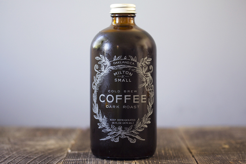
Coffee concentrate
Chava shared a great find in this coffee concentrate by local company, Milton and Small. We loved that the bottle shape and print style gave it a vintage look. The clever messaging was an added bonus to the success of this package.


Spitz
Spitz brand of sunflower seeds is the first of its kind to feature a re-sealable package, which attracted Ed as a huge selling point. How did this take so long?


Coke-sharing can
Coca-Cola always has amazing marketing strategies, and they have once again impressed our tea. Jason came across these cans with a twist, designed especially for sharing with a friend.


Wine boxes
Trader Joes’ Block Wine has a great package design that stood out among the other boxed wines on the shelf. Well designed in just one color, and their clever use of content, helped them fall right into Cyndi’s shopping cart.


Glade spray
Ying found this line of Glade air freshener with a unique flower petal design spray bottle.  Who wouldn’t want a product that looks AND smells pretty?


Hansen's club soda in small cans
Most of us have thrown out the half full bottle of soda water after it has gone flat.  These small serving cans offer a great solution to that problem, and we also thought they looked super cute!  Success in design and function?  You know we love that!

Tuesday, June 18, 2013

What's Up: June

Happy June! Summer is officially upon us, and we're enjoying the sunshine and lighter evenings. It also means two of our favorite things: art and wine! Want to join BIG at the 2013 Art & Wine Festival (Aug 3 & 4)? Mandatory training for all NEW volunteers will be held Thurs 7/18 or Tues 7/30 at 6pm. If you're interested – make sure to visit our Facebook page and leave a comment for more info. We'd love to see you there!


Boombotix Rex:
Check out this innovative new product made right here in the Bay Area.  Barbara recently sponsored Boombotix Rex on their Kickstarter program and we can totally see why. This rugged little speaker is water resistant and shatter proof, and comes with a “No matter what!” warranty.  The exterior packaging mirrors the speakers unique shape, and has a satin feel.  Well done, Boombotix!


Lagranja 360 Wine:
Chava found the Lagranja 360 brand of Spanish wine at Trader Joes.  We found their use of imagery on the label engaging, and had fun trying to guess the messaging behind them. (What’s black and white and read all over?)  And from what Chava says, it’s a great wine for the price.


Campbell’s Go:
Ed came across Campbell’s new ‘Go’ soup pouches both online and at his local market.  This convenient, single serving product uses minimal materials, can be opened without a can opener and goes right into the microwave.  The idea behind the design was to use various faces and speech bubbles to give the product a fun personality.  What do you guys think?  Are the faces fun or creepy??  


Wavy Lays:
Brands we know and love are always updating their look. Barbara immediately spotted the new Lay’s refresh for Wavy chips, but not because she liked it.  The hierarchy of the product name outweighed the brand, overall making the product look like a generic.  Sorry Wavy Lay’s, but we found this refresh to already be stale.


Kiyu Taro snacks:
Do you crave certain flavors when the weather changes?  Kiyu Taro snacks seem to think so.  We like how the product images are integrated in these watercolor inspired designs.   The bright single packages stand out against the natural look of the exterior carton.  Good find, Ying!


Thursday, March 1, 2012

What's Up: March

Spring is almost here! We don't know about you, but the BIG team sure is ready for that extra hour or two of sunshine that comes along with the time change. We love our Vitamin D---and packaging of course. With that said, we we bring to you "What's Up" the March edition. Enjoy!


John couldn’t resist bringing in this burger box from Carl’s Jr. We are guessing that they were aiming for a distressed look, but we think the end result just looks like a shabby print job. Hey Carl, call BIG, we can help you!


You’ve got to move fast to see all the updates in the gum world. Barb found these packs of gum that can stay together or be separated. We are always interested in dual purpose packages.


Cyndi picked up this Ivory product featuring the old and new logos. We agreed that the logo was dated and needed a refresh, but we didn’t love the result. We all thought it looked too generic and the clear label gave it a dingy feel, less clean than the iconic look of the original package.


Chava brought in this bunny box filled with treats. Each treat had its own packaging with hand wrapped detail and the folded carton made for a very cute presentation. We all really liked this one, although next time we’ll need more treats, Chava!


Jim shared this item that caught his eye both online and in retail. Lots of oohs and aahs over the artwork on this product.

Have you seen any interesting packaging? Share it with us in the comments section or on our Facebook page.

Tuesday, January 10, 2012

What's Up: January!

Happy New Year! We are back in the office and looking forward to seeing what 2012 has in store for us. We had such a busy December, that we had to skip our monthly "What's Up" meeting. But don't worry, we made sure to put it on the calendar this month. Without further ado, we present to you our January 2012 items:

Cyndi picked this up from Costco. In the club store environment, it really stood out on the shelf.
We all loved the matte finish, product photography and clean design.


Jason found these similar products on shelf at the grocery store. One geared
toward children, and the other more sophisticated package targets the adult
market. We're working on a similar project, so this was a great find!
Ed found these "liquid water enhancers" intriguing. We love the shape of the container and the logo!
What we love even more is that you can put 1/2 teaspoon of MiO Energy into eight ounces of
water to make 60 milligrams caffeine, which is 20 less milligrams than a Red Bull. Impressive!
We are usually drawn to "big" things, but look at how CUTE this gift card box
is that Jason received. The mini shoe box has a shelf insert to hold the gift card and
a sticker on the end to give the recipient/gift info. So clever and very well done!
Barbara brought in these drinks, they were merchandised well in store. We all agreed that they
look like they are from an international market, but they are produced right here in California!
Marit is in the market for new glasses, so she shared this "home try-on kit" from Warby Parker.
We love the idea behind this and not to mention, we had fun trying on the glasses.
Stay tuned for February's "What's Up!" I'm sure it will be filled with hearts and chocolate.

Tuesday, November 8, 2011

What's Up: November 2011

This month's meeting was full of great things!


Marit brought in this Jambox Jawbone speaker. The hard plastic top/cover allow for a 360 view of the product. The bottom of the box slides off to reveal a "door," which houses all the cords and a manual. We passed this one around, and even played music on it. The sound is as impressive as the package it came in!
Barb shared this Japanese candy from Nestle. Quite different than the Kit-Kat bars you find on the shelves at a local grocery!
 
Jason brought in this Biscotti packaging. The white box with graphics across the top are color coded for the flavors---it must create quite the shelf presence! The back contains a window to show the consumer that the product is individually wrapped. They must not have wanted to take away from the beautiful photography on the front of the box.

Jason picked up this Square Card Reader with Apple-esque packaging. The closure on the box is magnetic. Very well done, indeed.
Chava returned from Mexico with this collection of goodies from a coffee shop. Designed with Mexican flair and bold type, this was a hit at our meeting!

Chava shared this hair product with us. A simple package holds the hair product in place. Not only is the package cleverly designed, but so is the product! With a twist of the top and a swoop onto his head, Chava had a purple streak in his hair in the matter of seconds!

Cyndi picked up this candy, the tin caught her eye and something about "carbonated candy" was a bit intriguing.

Turn it over and WOW that's a big QR code.
John was doing some industry reading and came across the new BIG 10 logo. Consensus is that we like it. What do you think?

That's it for November. Stay tuned for December!

Monday, October 17, 2011

What's Up: October 2011

We have lots of fun things to share with you this month!

First up, is this perfume box that Barbara brought in. The box is on the left (love the metallics!) and the sleeve on the right went over the box. We couldn't quite figure out why it was designed this way; the sleeve is shorter than the box and when in place it does not look right. Perhaps they wanted to redesign the box but took a cost-effective way out by doing a sleeve only? The two are completely different designs, but promote the same product. Which do you prefer?

Chava picked up this unique bottle of wine, which we all agreed looks more like a bottle of Worcestershire Sauce. However, we'd recommend you drink it with your steak rather than putting it on your steak.

Cyndi went to the Alternative Press Expo (aka APE) and brought back this toy. The box is printed with his "story," very cute!

Marit found this book of Aesop's fables written entirely in Goudy. The stories themselves are even illustrated with type. Very clever.

Barbara took notice that this razor packaging was unique. The plastic peels away to reveal the razors, rather than pulling apart plastic from cardboard.

Chava brought in the packaging from his Kid Robot Swatch watch. The box and booklet were printed with some beautiful varnishes, and how could you resist the mustache-bunny creature thing?
Stay tuned for November's what's up. Have you seen any unique packaging while out shopping or cleaning out your attic? Share it with us at bigmouth@bigdesign.com!