Friday, August 17, 2012

August What's Up

What a busy month! Summer is almost over and Fall is on its way. The BIG team is not quite ready to bring out their long sleeves, sweaters and jackets. But one thing that we are ready for: Halloween Candy! I wonder what oversized treats we can find this year...
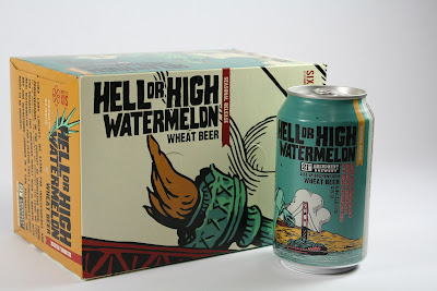

Hell or High Watermelon Beer
Hell or High Watermelon Wheat Beer, a seasonal favorite, jumped right into Barbara’s shopping cart.  The cans and outer packaging is designed with great illustrations of San Francisco and Independence Day.  A local beer is always a treat and a welcome guest at our What’s Up meetings!


Benefit Cosmetics Package
How fun are these package designs from Benefit cosmetics? Ying picked them up at a department store, and she especially liked the color pallet.  The team liked the retro look FEMALE action figure, and check out the texture that was printed on the side of the record player.  We love how the unique packaging made these products stand out in a very competitive industry.  


R-Evolution Cuisine
Leave it to Chava to find ways to make his food into art!  The photography and satin finish of the exterior package design makes you want to open up this foodie gadget and get creative.  Each box inside reflects elements of the periodic table, keeping a scientific feel. This box is a real consumer experience.


USA Olympic Team Uniforms
It’s no secret that we are BIG fans of the Olympic Games.  One thing that stood out for John was how great the high tech uniforms and warm up clothing designs looked.  We loved how Team USA represented in action and on the podiums.  Now how do we get a pair of those green shoes?

Friday, August 3, 2012

Attention WalMart Shoppers...

Toshiba approached us to create an external hard drive package that would speak to the WalMart “Back-To-School” shopper. It was our goal to communicate the ease of protecting memories while reinforcing their “Clickfree Automatic Backup” software. Images were selected that represented important times that moms (our target customer) would be emotionally drawn to. We think the package came together quite nicely!


Our design didn't stop with the package. We moved on to design the pallet as well. After all, they don't call us "retail experts" for nothing! This pallet was sited just south of our office:


Thursday, July 12, 2012

July What's Up

Summer is flying by! We've been enjoying it, and are gearing up for the 2012 Fremont Art and Wine Festival – more details on that will be coming soon. Make sure you are following us on Facebook for updates. We hope to see you there! In the meantime, here are the great finds from the BIG team:


The new Nike NFL uniforms have been revealed, and Barbara shared how the branding was caught by these receiver gloves.  The gloves feature an interlocking logo design printed across the palms.  Can't wait to check them out when the season starts.  (Go Niners!)


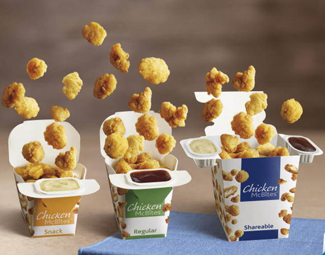
It's a rare occassion that brings Chava to McD's, but leave it to him to find an interesting package design while he was there.  The McBites popcorn chicken comes in a carton that conveniently folds open to hold the sauce.  The team discussed the possibility that this package was Asian inspired, in both the product and the structure design.


Check out these ice cream bars that Ying shared with us!  Not only do we love the branding, we think it's super cool that they printed right on the ice cream.  You can find the location of their boutique ice cream shops at www.bardotbars.com

Tuesday, June 26, 2012

June What's Up

It's that time of the month again! The BIG team got together over lunch and shared packaging that caught their eye, whether it be good or bad. Here's our top three picks to share with you. If you're out and about and see great packaging – snap a photo and share it with us on Facebook!


Stride’s Tropical Trance gum had Ying fixated on the dizzying black and white package.  The color choice made this gum stand out among so many colorful packs of gum on the shelf.  

Check out these coke cans printed in the iconic ‘coke bottle’ shape.  We love the clean look and feel of this packaging.  Chava explained the printing and shaping process of the aluminum and shared that the vending display was beautiful and very impactful in store.  Chava brought us a Coke and a smile!

We are BIG fans of the Olympics, and it’s always a major event in the design world.  Unfortunately, we feel that the 2012 designs were not medal worthy.  The mascot, the event icons, and even the ticket design were disappointing; and we found the final art to be very childlike and the concept un-relatable. 


Tuesday, June 19, 2012

The shoemaker's children got new kicks!

It's out with the old, and in with the newer, better, and BIGger! The BIG team has been hard at work and we are thrilled to reveal our new website. Check it out – meet the team and see our latest work.


A BIG thank you to our entire team, who would likely compare the entire experience to birthing a 15 pound baby. Breach. With no epidural. Everyone worked their butts off, but the end result...it was well worth it.

Thursday, June 7, 2012

From paintbrush to pixels.

Talking about a unique project! It was our goal to give this package some "farmer's market" appeal. We took away Chava's mouse and handed him a set of paintbrushes to get started. He freshened up his skills after watching a little Bob Ross on YouTube, then got to work.


The watercolors gave the package a truly handmade feel, and with a quick scan and some photo manipulation – it turned into a vibrant work of art! You can find HMC Farms at a grocer near you!

Thursday, May 24, 2012

May What's Up

It's time for us to share "what's up!" It never fails, our team always manages to find the coolest stuff. If you come across packaging that catches your eye, send us a photo and we'll share it on Facebook!


This new look for Pureology hair products is sleek and clean. The updated design
of the bottles’ shape and color gives a more luxurious feel to this already
upscale product.  And Barbara’s hair couldn’t be looking better!


Wonka brand is known for turning sweets upside down and this time they’ve done it with ice cream! We gave a thumbs up to the cool flipped package design and concept, and Cyndi gave a thumbs up to the ice cream.  (Barb and Chava are waiting for their own taste test!)  The top (or bottom) of the container with its one color print and date stamp seemed like an under utilization for such a visually prominent area.


Chava shared this Califa Farms brand almond milk bottle and we LOVED it.  The clean fonts, the glossy printing on a matte finish, and the bottle’s shape and feel got a great reaction from our team.


This Dorset Cereal box got Barbara’s attention on the shelf. Brightly colored uncoated material, a combination of matte and metallic printing, and a product window made this product stand out from the competition. We hope this product is as delicious as its packaging!