Wednesday, December 12, 2012

December What's Up

It's our last What's Up of 2012! In just a few short weeks, we'll be closing up the office to celebrate the holidays with our friends and family. But don't worry – we'll be back and ready to get hard to work in 2013. Just in time for our next What's Up meeting. Happy holidays from the entire team at BIG. But first...What's Up December!


Nest Learning Thermostat
Chava had recently purchased the innovative Nest Learning Thermostat for his home.  Our team was impressed by both the package and the product inside.  And Chava was excited because he was not only able to easily install the thermostat himself, but the mobile app allows him to make adjustments when he is away from home.  Nest has really thought of everything, and we appreciate that in a company.  To learn more about this product, check out www.nest. com.


Absolute Tune
Chava found this AWESOME package for Absolute Tune, which is marketed as a “Sparkling Fusion” between vodka and white wine.  It is showcased with a unique double design label.  The beautiful outer wrap unzips to reveal a second gorgeous design underneath.  This bottle is faaaanccyy!  And a perfect way to celebrate NYE or any special occasion.


Starbucks gift packages
Ying spotted these holiday gift boxes at Starbucks. The advent calendar packaging was very creative, as was their entire holiday display.  It creates an urge to impulse buy; even if you don’t drink coffee!  Our team discussed how consistently strong Starbucks is with their retail packaging and gift items throughout the year.   Well done (extra hot, with whip)!


Caterpillar shoe package
As you can see, this is no ordinary shoebox!  John shared this packaging design from Caterpillar that gets its inspiration from a bulldozer’s track.  We liked the detail of the corrugate band and the minimal use of materials.  This look is sure to set this item apart from the other work boots on the shelf!


Speck
Check out this peggable Speck package that Ed found at an Apple Store.   A button on the back of the clamshell allows you to slide the product out without damaging the outer package design.  We also liked the look of the printing (done at a local print house);  the varnish really adds a layer to the package design to help it to stand out.

Monday, November 12, 2012

November What's Up

Are you getting as excited for Thanksgiving as we are? BIG staffers sure do love to eat, so this is one of our favorite holidays. Because really, what's better than a day with friends and family and a spread of delicious food?


Arizona Beverages
Ed shared this contest-winning design for Arizona Beverages’ 20th anniversary.  Artists from around the world submitted illustrations for their Cherry Lime Rickey flavor. We agree that the final design is a BIG winner!


Stiga
Check out these COOL ping pong paddles Ying shared.  The paddles were offered in vibrant colors, and then they took full advantage of the look with the coordinating clear package.  This is a great example of packaging giving a product the competitive edge.


Campbell's
Campbell’s released a limited edition label design series celebrating 50 years of Andy Warhol’s iconic work.  We LOVED LOVED LOVED these soup cans.  How could you not???


Simply Bliss
John thought this Simply Bliss ice cream package design was simply beautiful.  The layout and use of quality imagery will help this brand get noticed in a very competitive market.  And it made us all want ice cream, so job well done!


Biotherm Homme
When Chava brought in this package from Biotherm Homme, we were impressed with the metallic printing and use of product image.  But wait, there’s more!  Instead wasting paper on an insert, the product instructions have been printed on the inside of the package.  There is perforation to make it easy to open and read. Somebody is thinking INSIDE the box for a green solution, and we think that rocks!


Pop Tarts/Clif Bar
Barbara found these limited edition products with a seasonal look. These brands are already dressed in their holiday best. 


Orbit
These mini-packs of gum are perfect for those times you don’t want to carry a purse but want to keep away the yuck mouth.  No more finding gum stuck in the pocket of your jeans after washing.

Tuesday, October 30, 2012

Last Minute Creative Costumes

Halloween is a day away, do you have your costume picked out yet? If your answer is no, don't start freaking out just yet because we have some easy and creative ideas that you can pull together lickity split.


Old man from "Up"
How cute is this "old man?" No matter how old you are, you can pull this one off with some PVC pipe, tennis balls, balloons, bow tie, cardigan, corduroys and glasses. This has been a hit on Pinterest, but the original photo is via Auburn Soul Photography.


Mortons Salt Girl
I especially love this costume.  A yellow dress or coat worn with white tights and some yellow shoes (or black if you can't find em!) and paired with a white umbrella and some salt as a prop – and you are set.


Pixel Person
Our office is geeking out over this get up. A square template, some scissors, fabric and paint is all you need! And most likely some patience.... 


Here are some other great ideas from the web we gathered for you:
And, if you just need a good laugh, check out these hilariously awkward Halloween photos.


Friday, October 12, 2012

October What's Up


Why hello October, you are here already? The holiday season has officially begun! We're all getting very excited for Halloween and can't wait to share our costumes with you. Like last year, we'll be heading out to a team lunch to show them off. But don't worry, we'll show them off on Facebook as well. Make sure you like our page so that you don't miss out!


2012 Nike Women’s Campaign
John shared the 2012 Nike Women’s Campaign, which features first-person outlooks on how sports and fitness has shaped women’s bodies and attitudes. We loved the visual impact of the ads, which communicated both strength and beauty.  They matched the visuals with content that also packs a punch.  Well done!


Tout Sweet
Chava recently visited Tout Sweet, a patisserie in San Francisco.  The shop’s clean, vibrant design is upstaged only by the amazing treats behind the glass.  Tout Sweet has creatively designed to-go boxes and bags featuring the compound formula for sugar, which is super nerdy cool. Since SOMEONE (named Chava, but we won’t point fingers) didn’t bring us any samples, we think a field trip is in order!  


Boom Chicka Pop
Get your sunglasses! These bags of BOOM CHICKA POP are screaming to be grabbed off the shelves.  Barbara saw them from several aisles away!  Once you’ve adjusted your eyes to the bold and bright packaging design, you can check out the clever messaging on the bag.  We were glad we gave them a closer look.


Thursday, September 20, 2012

Somebody call security! This aisle display BIG designed for Norton is bound to make a scene.  Check it out at Staples stores near you.


Wednesday, September 5, 2012

September What's Up

Fall is almost here! You know what that means...lots of candy consumption in the BIG office. Which also means, we will probably see some candy packaging at next month's What's Up meeting. Stay tuned for that, but in the meantime, check out these great finds from the BIG staff!


Ugmonk
We shared in the full consumer experience when Chava opened the newest promo from Ugmonk. Enclosed in a birch wood package were a 4th anniversary T-shirt, a collector’s card and limited edition letterpress block. Wow, what a cool promo!


Giada/Target
Target is carrying a line of specialty foods by the Food Network’s Giada De Laurentiis. Jason shared that her brand and display had a strong shelf presence.  We liked how the lighter color pallet made this packaging stand out from the more established brands.


Stafidenos Raisins
Check out how this raisin box goes from good to GREAT! Stafidenios created a dual-purpose package that first holds their product, and then can be easily transformed into a figure. Not hard to see the added value that this package design brings to the product. We bet Ying has already started a collection!


ID Gum
It seems like Stride comes out with a new line of gum every week! And that’s why we pay attention.  ID gum is a new brand targeting the teenage market.  We all liked the look of the in-store displays, the creative artwork on each package, and the magnetic closure.

Friday, August 17, 2012

August What's Up

What a busy month! Summer is almost over and Fall is on its way. The BIG team is not quite ready to bring out their long sleeves, sweaters and jackets. But one thing that we are ready for: Halloween Candy! I wonder what oversized treats we can find this year...


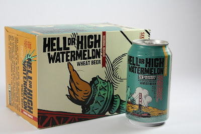
Hell or High Watermelon Beer
Hell or High Watermelon Wheat Beer, a seasonal favorite, jumped right into Barbara’s shopping cart.  The cans and outer packaging is designed with great illustrations of San Francisco and Independence Day.  A local beer is always a treat and a welcome guest at our What’s Up meetings!


Benefit Cosmetics Package
How fun are these package designs from Benefit cosmetics? Ying picked them up at a department store, and she especially liked the color pallet.  The team liked the retro look FEMALE action figure, and check out the texture that was printed on the side of the record player.  We love how the unique packaging made these products stand out in a very competitive industry.  


R-Evolution Cuisine
Leave it to Chava to find ways to make his food into art!  The photography and satin finish of the exterior package design makes you want to open up this foodie gadget and get creative.  Each box inside reflects elements of the periodic table, keeping a scientific feel. This box is a real consumer experience.


USA Olympic Team Uniforms
It’s no secret that we are BIG fans of the Olympic Games.  One thing that stood out for John was how great the high tech uniforms and warm up clothing designs looked.  We loved how Team USA represented in action and on the podiums.  Now how do we get a pair of those green shoes?

Friday, August 3, 2012

Attention WalMart Shoppers...

Toshiba approached us to create an external hard drive package that would speak to the WalMart “Back-To-School” shopper. It was our goal to communicate the ease of protecting memories while reinforcing their “Clickfree Automatic Backup” software. Images were selected that represented important times that moms (our target customer) would be emotionally drawn to. We think the package came together quite nicely!


Our design didn't stop with the package. We moved on to design the pallet as well. After all, they don't call us "retail experts" for nothing! This pallet was sited just south of our office:


Thursday, July 12, 2012

July What's Up

Summer is flying by! We've been enjoying it, and are gearing up for the 2012 Fremont Art and Wine Festival – more details on that will be coming soon. Make sure you are following us on Facebook for updates. We hope to see you there! In the meantime, here are the great finds from the BIG team:


The new Nike NFL uniforms have been revealed, and Barbara shared how the branding was caught by these receiver gloves.  The gloves feature an interlocking logo design printed across the palms.  Can't wait to check them out when the season starts.  (Go Niners!)


It's a rare occassion that brings Chava to McD's, but leave it to him to find an interesting package design while he was there.  The McBites popcorn chicken comes in a carton that conveniently folds open to hold the sauce.  The team discussed the possibility that this package was Asian inspired, in both the product and the structure design.


Check out these ice cream bars that Ying shared with us!  Not only do we love the branding, we think it's super cool that they printed right on the ice cream.  You can find the location of their boutique ice cream shops at www.bardotbars.com

Tuesday, June 26, 2012

June What's Up

It's that time of the month again! The BIG team got together over lunch and shared packaging that caught their eye, whether it be good or bad. Here's our top three picks to share with you. If you're out and about and see great packaging – snap a photo and share it with us on Facebook!


Stride’s Tropical Trance gum had Ying fixated on the dizzying black and white package.  The color choice made this gum stand out among so many colorful packs of gum on the shelf.  

Check out these coke cans printed in the iconic ‘coke bottle’ shape.  We love the clean look and feel of this packaging.  Chava explained the printing and shaping process of the aluminum and shared that the vending display was beautiful and very impactful in store.  Chava brought us a Coke and a smile!

We are BIG fans of the Olympics, and it’s always a major event in the design world.  Unfortunately, we feel that the 2012 designs were not medal worthy.  The mascot, the event icons, and even the ticket design were disappointing; and we found the final art to be very childlike and the concept un-relatable. 


Tuesday, June 19, 2012

The shoemaker's children got new kicks!

It's out with the old, and in with the newer, better, and BIGger! The BIG team has been hard at work and we are thrilled to reveal our new website. Check it out – meet the team and see our latest work.


A BIG thank you to our entire team, who would likely compare the entire experience to birthing a 15 pound baby. Breach. With no epidural. Everyone worked their butts off, but the end result...it was well worth it.

Thursday, June 7, 2012

From paintbrush to pixels.

Talking about a unique project! It was our goal to give this package some "farmer's market" appeal. We took away Chava's mouse and handed him a set of paintbrushes to get started. He freshened up his skills after watching a little Bob Ross on YouTube, then got to work.


The watercolors gave the package a truly handmade feel, and with a quick scan and some photo manipulation – it turned into a vibrant work of art! You can find HMC Farms at a grocer near you!

Thursday, May 24, 2012

May What's Up

It's time for us to share "what's up!" It never fails, our team always manages to find the coolest stuff. If you come across packaging that catches your eye, send us a photo and we'll share it on Facebook!


This new look for Pureology hair products is sleek and clean. The updated design
of the bottles’ shape and color gives a more luxurious feel to this already
upscale product.  And Barbara’s hair couldn’t be looking better!


Wonka brand is known for turning sweets upside down and this time they’ve done it with ice cream! We gave a thumbs up to the cool flipped package design and concept, and Cyndi gave a thumbs up to the ice cream.  (Barb and Chava are waiting for their own taste test!)  The top (or bottom) of the container with its one color print and date stamp seemed like an under utilization for such a visually prominent area.


Chava shared this Califa Farms brand almond milk bottle and we LOVED it.  The clean fonts, the glossy printing on a matte finish, and the bottle’s shape and feel got a great reaction from our team.


This Dorset Cereal box got Barbara’s attention on the shelf. Brightly colored uncoated material, a combination of matte and metallic printing, and a product window made this product stand out from the competition. We hope this product is as delicious as its packaging!

Wednesday, May 16, 2012

Clean design, clean floors!

We are thrilled to have been chosen to work with Neato. It was our job to improve the communication and identity of their current packaging. BIG loves makeovers!

Our design team worked together to "clean up" this vacuum packaging to prepare it for club stores. Not only did we freshen up the package with design improvements, but we also reworked the copy to speak to the consumer in a friendly and inviting tone.


Beyond the package, we also provided pallet designs, their sales presentation, sampling for pallet testing and tray printing. The result? An automatic vacuum cleaner that will be swept off the shelves!


Neato has been a true pleasure to work with, and together we have been able to make so many improvements on their product. Not to mention, our office is now a much cleaner place thanks to our office Neato. No more "5 second rule" here – our floors are CLEAN!


Friday, April 27, 2012

April What's Up

I bet you thought you were going to have to wait until May before you saw the April What's Up meeting goodies? We've been SO BUSY working on our new website (it's coming soon, we promise!) and trying to prepare for the Art and Wine Festival this year. The festival will be on August 4th and 5th so mark your calendars. Stay tuned for a post about that as well. Now, back to What's Up!


Barbara shared the package refresh for Honey Maid Graham Crackers. An updated logo, outer package refresh and new interior product packaging made for a lot of changes. We felt that the changes were well executed and effective. Too bad Barb didn't bring in some marshmallows and chocolate too!

These Kind Fruit & Nut bars caught Barbara’s eye on the shelf because of their bright color palette
and showing of the actual product. The transparent package works well with the design layout,
and may make the consumer more confident in their purchasing choice.


 Ed brought in a few pieces from his offset-type printing collection. It was fun to see
how far we’ve come in the design world in such a short time.


Tuesday, April 17, 2012

BIG sighting!

Hey, check out what came in the mail – the latest issue of Costco Connection. We were perusing it's pages when we stumbled across this Norton ad that we put together. There's definitely something rewarding about seeing something you've worked on in places OTHER than a monitor.


Wednesday, March 28, 2012

BIG ideas start here!

As we continue to work on our rebrand, we're always finding things that need updated. Our pencils are always a BIG hit in meetings. It's pretty awesome to see them on desks and bookshelves throughout the years when we are meeting with clients.

After several different versions and a couple rounds of matching of paint swatches, and maybe a few revisions...they've arrived! So when you consider your next project, consider BIG and one of these babies might find their way to your office!